Here at Signature Prints, we are loving Pantone’s colour of the year for 2019 ‘Living Coral’. This bright, happy hue is a great colour for interiors and can be played up or down depending on the room and colours it is paired with.
It is the perfect spring/summer colour – evoking tropical islands, colourful cocktails and long summer days – yet we see it transitioning well to become a welcome injection of warmth in the colder winter months.
So how can you incorporate this exciting colour into your space?
We have put together three different looks that show the diversity of this colour, from creating dramatic and immersive experiences for the bold colour user to subtle pops of colour for the less adventurous.
Complementary
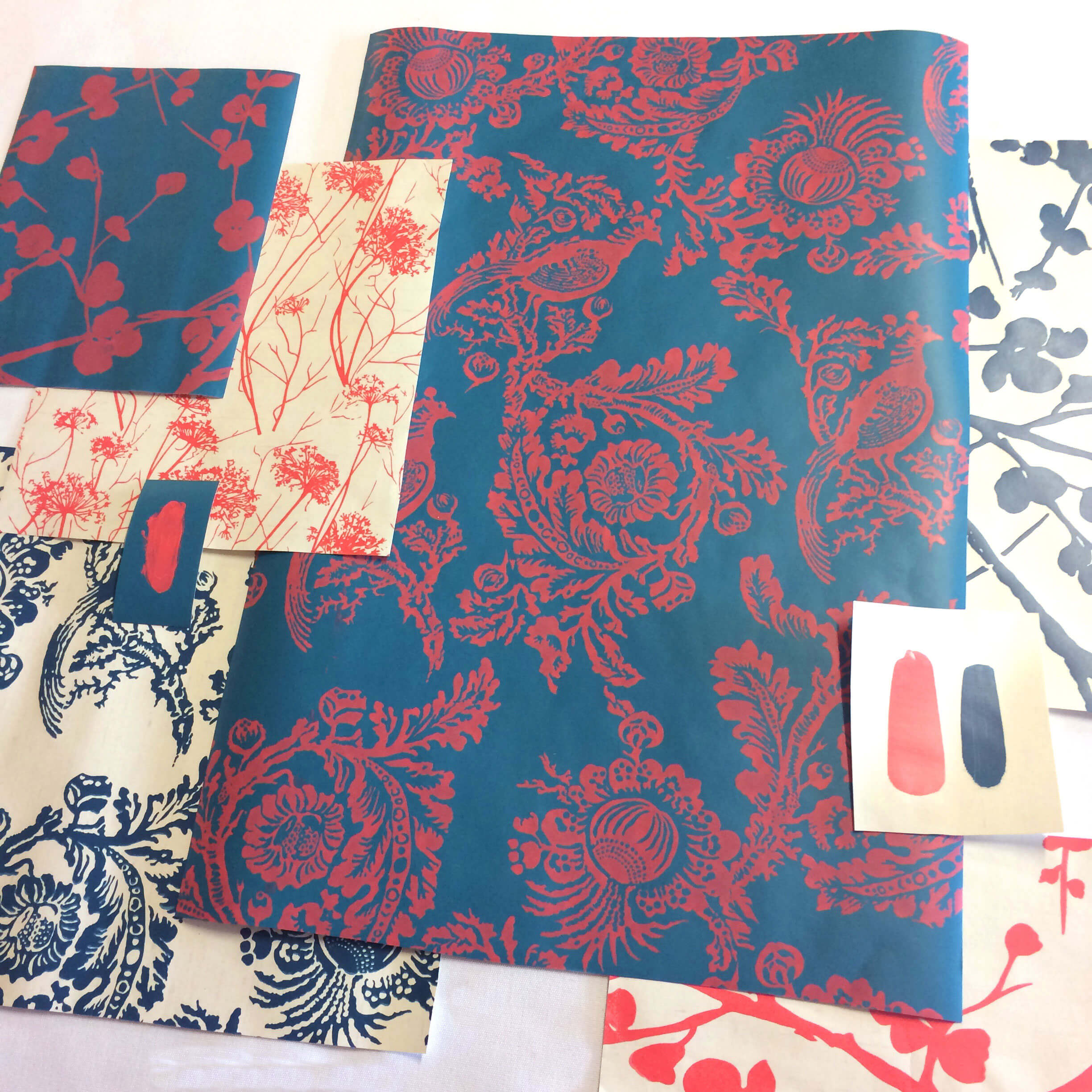
A complementary colour scheme. Featured designs: Songbird, Glenorchy, Garden Shadows.
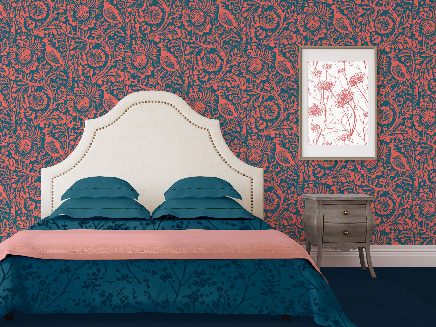
In this first colour scheme, we have teamed our coral up with a lovely deep teal. The complementary nature of these two hues creates visual excitement and drama, perfect for a highly modern look. Teal is another colour that has been tipped to be a hot trend for interiors this year, with darker-toned walls in particular, gaining a resurgence in popularity.
Warm Tones – coral, pink and red
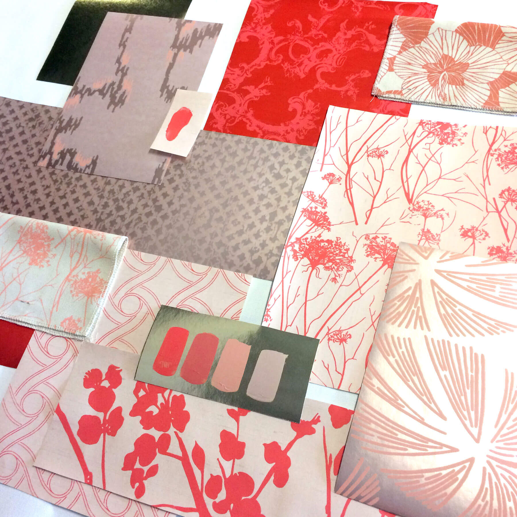
A tonal colour scheme. Featured designs: Amazonas, Songbird, Garden Shadows.
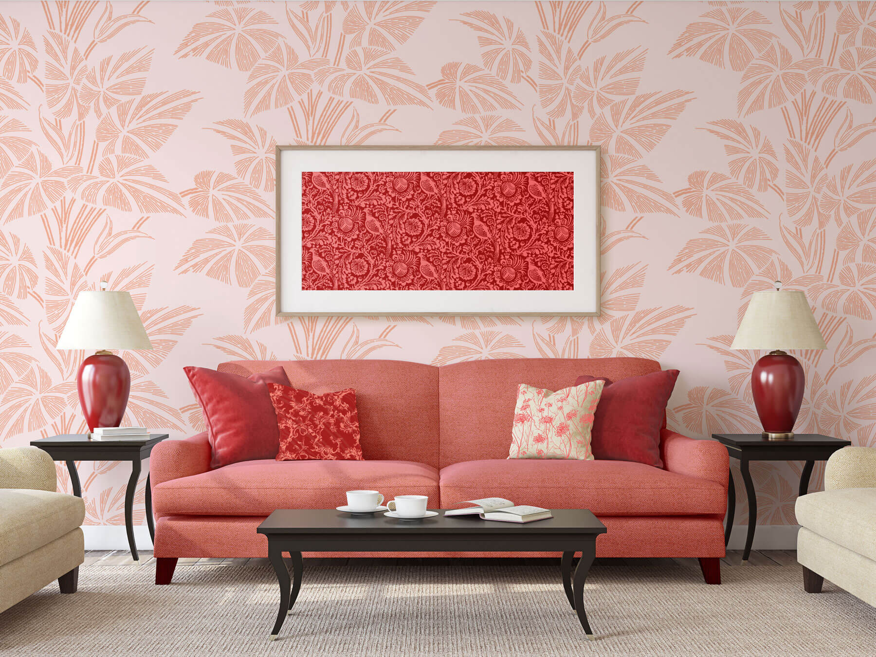
Whilst different shades of pink invariably fall in and out of style over the seasons, they still remain an incredibly popular choice for interior decorating. In this scheme we have used accents of Coral and red to add a bolder edge to a pink colour scheme. Soft, pretty ‘millennial’ pinks are offset by the bright orange tones of the coral and the richness of the deep red, resulting in a look that is more graphic than girly. For a touch of glam pair these colours with gold accents, or go one step further and embrace trendy Rose Gold.
Colour Pop
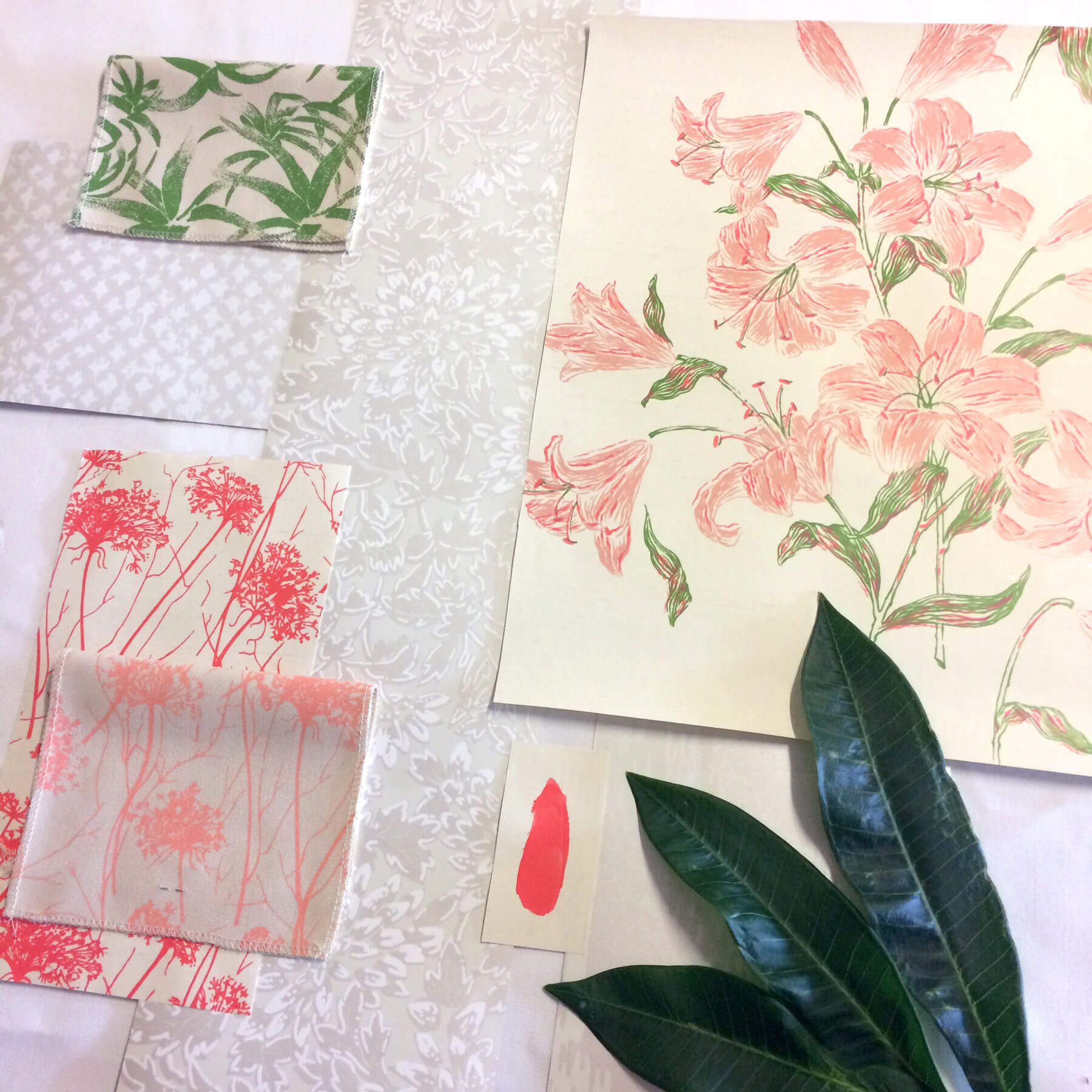
A neutral scheme with a bright accent. Featured designs: Tigerlily, Treillage, Garden Shadows.
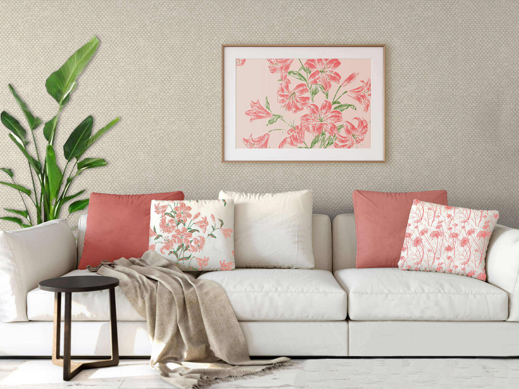
If the thought of painting or wallpapering a whole room in this vibrant shade fills you with terror then we suggest embracing it as an accent colour instead. Use Coral to draw attention to key accent pieces in a subtle neutral interior scheme – maybe an accent cushion or lampshade, or a stunning art piece. In this scheme, we have accented a calm neutral scheme with a pop of coral to create a contemporary feel and a more subtle nod to this vibrant colour.
